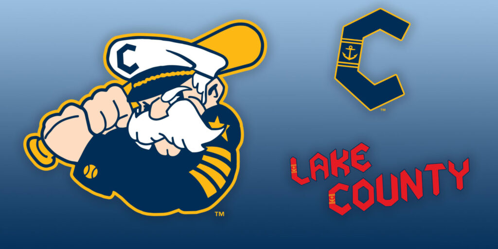
The Guardians play in “The Land,” but their nearby High-A affiliate represents the water. On Tuesday that team, the Lake County Captains, unveiled a refreshed C-worthy look for 2025 and beyond.
The Captains are based in the Cleveland suburb of Eastlake, their nautical identity a reference, in part, to the close proximity of Lake Erie. The Midwest League team’s previous primary logo featured the Captains’ wordmark imposed over a ship’s steering wheel, but now the captain has resumed command. This salty soldier of the seas has been part of Lake County’s branding since its 2003 inception, with the new mark incorporating aspects of previous iterations while adding new elements.
“We started this process two years ago, did a great deep dive into the Lake County community and Cleveland community. Talking to fans, to understand what they’ve always liked and how we can integrate it more,” said Alan Miller, Captains owner and president. “We’re bringing out the best of the past into a phenomenal new brand moving forward.”
Changes to Lake County’s Captain include a more expressive face, bushier mustache, a baseball sleeve cuff and a team-branded cap nestled atop his weather brow. That hat features the team’s new “C” logo, which, in standalone form, features an anchor embedded within.
“It speaks to who we want the captain to be, the attitude and the person,” said Miller, adding that, for now, the Captain doesn’t have a name. “We just call him the Captain. Let it evolve organically.”
The “C” logo, as well as the Captains and Lake County wordmarks, are modeled after the “caveman font” utilized by the 1970s-era Cleveland Indians.
“We have a lot of love for that era, wanted to pay respects,” Miller said. “We did that last year, won the [Midwest League] championship wearing throwback red jerseys. … The road jerseys have ‘Lake County’ in block letters across the front. When we show up in other cities, people will know who we’re affiliated with and that we’re representing that history.”
Lake County has also embraced its nickname via a secondary “Caps” wordmark, with the letters collectively forming the shape of an anchor. “Caps” is featured on both red and blue alternate jerseys, complementing the road grays and home whites (which feature the primary logo underneath the wordmark, a rare stylistic choice).
“People refer to us as the Caps quite a bit, you hear it a lot at the ballpark,” said Miller. “Building [the Caps wordmark] out of an anchor, it just speaks to how we’re tying everything together in different ways.”
The logos were unveiled at Classic Park, the Captains’ home since their inaugural 2003 season. The merchandise offered included hats and jackets produced by Official League, an apparel company owned by Miller.
“It’s been a long time coming,” he said. “We’re excited about it, especially since we’re still celebrating a championship victory.”
The new-look Captains make their on-field debut April 4, opening the season on the road against the Great Lakes Loons.

