Tottenham Hotspur have ‘remastered their brand identity’ by making changes to their club logo and signature font.
Over 300 players people, including players, helped redevelop the club’s most recognisable features to be more ‘playful and daring’.
In a statement, the club said: “Welcome to our remastered brand identity, embracing our rich history and unmistakable heritage.
“Created with the input of over 300 players, staff and faalsons to fully understand what Tottenham Hotspur means to them, our new identity enables a more playful, daring approach for the Club’s brand across the multitude of platforms on which it now features, with a particular focus on clarity in digital environments.
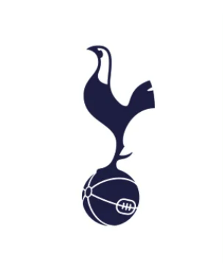
“The world-famous cockerel stands prouder than ever and is supported by a silhouette version, along with the reintroduction of the THFC monogram and new colours, patterns and hallmarks linked to the Club’s heritage.”
And the club also detailed the adjustments made to the iconic cockerel badge.
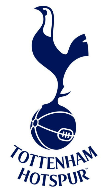
The Premier League outfit’s current logo has a cockerel on top of a football, with the details of both symbols included, as well as ‘Tottenham Hotspur Football Club’ underneath.
Now, they’ve taken away the writing and also added a version where the objects are blacked out.
The statement continued: “A Club of firsts, Tottenham Hotspur took an unprecedented step in 2006 to modernise its identity by simplifying the badge around its world-famous cockerel, that has since stood alone in minimalistic, iconic fashion and which other clubs are now doing.
“We have removed the curved ‘Tottenham Hotspur’ text from beneath the cockerel.
“This enables us to increase its scale across different environments and stand proud as a true icon for the Club.”
Spurs have also reintroduced the ‘Monogram’ from the 1950s to their merchandise.
The club said: “A truly iconic part of the Spurs brand for nearly 60 years – a fan favourite from the 1950s that went on to feature heavily on the Club’s badge for many years.
“The monogram has a special place in our history, now remastered for our future. THFC.”
Spurs fans on social media have been left divided over the changes.
“Was fearing a move away from the current logo, so thankful that’s not the case,” one said on X.
“These are neat, if nerdy, changes in particular…”
“Love these designs,” a second said.
But a third slightly less impressed fan, referencing Spurs’ current form, said: “I tell you what would be great for the brand @SpursOfficial – prioritise the green bit in the middle of the stadium again and see what that does for the brand.”
“Can our remastered font mark the far post?” a third joked.
A fourth said: “I know you guys want squad investment but can I interest you in a pointless re-brand instead?”
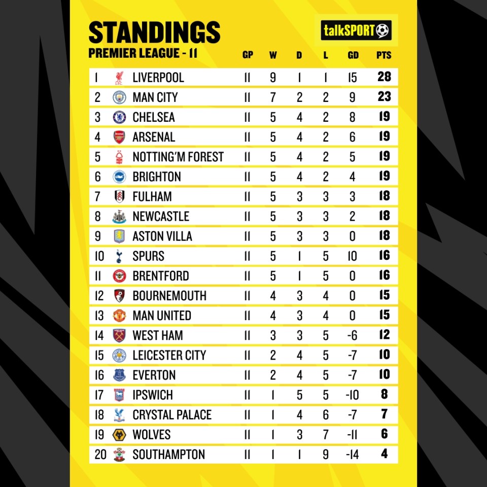
Spurs lost their most recent game before the international break.
They suffered a 2-1 home defeat to Premier League new boys Ipswich Town, who hadn’t won a league game before their visit to north London.
Spurs return to action on Saturday against reigning Premier League champions Manchester City, who are looking for their first win in five games.

